
 Written by
Daniel van Hek
Search Clicks·October 11, 2026
10 min read
Written by
Daniel van Hek
Search Clicks·October 11, 2026
10 min read
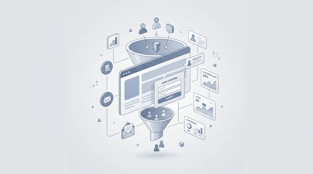
Imagine this: you’re doing everything “right” in marketing. You’re getting traffic. You’re spending campaign budget. You’re publishing content. And still, lead generation feels like a gamble. In that case, there’s a good chance your website wasn’t built to guide inquiries. Not because your audience “isn’t interested,” but because your conversion paths are messy, your forms create friction, or your tracking is off.
In this article, we’ll build a lead generation website that actually works. We’ll look at strategy and execution, from funnel position to form design, calls to action (CTA) and measurable optimization. You’ll get a practical step-by-step plan, including what to tackle first, why it works, and what the next step is. And no, we’re not going to promise you more sales tomorrow. We’re going to make sure your process measures reliably and your site keeps performing better.
Let’s get specific right away. A lead generation website is not a “pretty brochure with a form somewhere at the bottom.” It’s a conversion machine for online marketing and online sales. Concretely, that means:
And importantly: you don’t confuse marketing behavior with lead generation. Visits, clicks, or scrolls are not leads by themselves. A lead is only a lead when you’ve received identifiable contact details or a real commercial inquiry (for example, a completed form, a demo request, or a started intake conversation).
You can build a lead generation website based on assumptions, but that will cost you months. Better: design for behavior, with a clear structure for every step in the funnel.
You need an ICP, an Ideal Customer Profile, meaning a profile of who you actually want as a customer. Then you connect content and conversion paths to TOFU, MOFU and BOFU, meaning Top, Middle and Bottom of the Funnel.
In practice, that means your homepage can certainly include a lot of explanation, but your lead generation happens mainly through landing pages that match intent. A general page for everyone is rarely strong for conversion.
Lead generation often fails at positioning. Not because your offer is bad, but because you explain too much and show too little of “what’s in it for me.” So above the fold (in the first screen area), put these parts on every important conversion page:
Dry humor for your team: if your visitor is still unsure after 8 seconds, your form becomes a test of their patience.
A lead generation website needs multiple landing pages. Not ten generic versions, but pages with one goal: trigger a specific commercial next step.
Your form is your most important conversion gate. But it’s also your biggest source of friction. We handle that smartly with three principles.
Practical guideline: for the first lead, we often want name, email address and company name. Phone is useful if you call directly or schedule an appointment. Questions like “what is your biggest challenge” can provide valuable context, but only if you actually use them for qualification.
On lead generation pages, there should be one primary CTA. That doesn’t mean you can’t show secondary options, but it does mean your primary path must be dominant.
Examples of primary CTA’s that fit BOFU or MOFU (choose based on your sales process):
And place your CTA in logical spots: above the fold, repeated after proof, and on the form itself. Not every block needs a different button. Your visitor is not a mind reader.
You can’t just say you’re good. You need to show how you work and what you deliver. So add:
Watch the trade-off: too much text can hurt conversion. Work with scannable bullets and add details on request through an accordion or follow-up steps.
A lead generation website without reliable measurement is a nice car with a broken speedometer. You think you’re driving faster, but you don’t actually know.
In Google Analytics 4, GA4, conversions are linked to important events. Google explains how conversions in GA4 are created from events, so you can measure actions consistently in GA4 and Google Ads. (support.google.com)
Build your measurement plan in layers:
This keeps you from optimizing only for “form submissions” while your real goal is conversion to qualification.
You don’t have to treat Core Web Vitals like a religion. But you do need to know how your pages “feel.” In Search Console, there is a Core Web Vitals report, and Google says this report shows how your URLs perform in real user experience. (support.google.com)
Google also stresses that a good score does not automatically mean you’ll rank at the top in Google. Page experience is therefore a relevant signal, but not the only factor. (developers.google.com)
In practice: we use this to reduce conversion friction. Faster load times and a more stable layout mean fewer drop-offs during the form moment. That’s directly relevant for lead generation.
Search Console helps you see where your visibility comes from and which pages are under pressure. Combine that with your CRO reports. If a page gets a lot of impressions but few inquiries, the issue is often content match, CTA or form friction, not “SEO in general.”
And yes, there are reports in Search Console that help you assess page experience. (support.google.com)
Now for the fun part. CRO is not a one-time checklist. It’s a rhythm. We do this practically, with tests that actually tell you something.
The #1 conversion trap we often see: someone clicks on a promise, but lands on a page that covers the same topic without answering the same question.
Approach:
Why this works: you reduce uncertainty. Uncertainty is mental friction, and friction lowers conversion.
If people drop off heavily on your form, it’s usually not “because your form is bad.” It’s often because one field is one field too many, the layout is unclear, or validation feels too strict.
Practical tests:
Trade-off: fewer fields give you less context. That’s why we test with a plan. What you miss in data, you can potentially collect later in a qualification call.
Visitors scan. That’s why proof works best when it addresses their doubts at the moment those doubts arise.
We do that by:
Why this works: it lowers the feeling of risk, and that feeling of risk is often the real reason people delay.
You don’t have to choose between Search Engine Optimization, SEO, and Search Engine Advertising, SEA. A lead generation website uses both as two routes toward the same conversion goals.
With SEA, meaning Search Engine Advertising, you send traffic directly to pages that make the right next step easy. That makes your results measurable and your optimizations faster.
Note: SEA performance means nothing without good landing pages. If your CTR is high but your lead volume is low, the problem is on the page and in your form.
SEO, Search Engine Optimization, often brings traffic that isn’t ready to call right away. That’s fine. You use that TOFU or MOFU information to move them toward BOFU with targeted CTA’s and landing pages.
If your team wants to improve the SEO setup even further, you can use this practical article as context: SEO: Complete Guide to Search Engine Optimization.
No magic: SEO works as long as your content match and conversion paths are in order.
If you want to start this tomorrow, here’s how I’d do it. Short and realistic.
If you take one thing away, let it be this: a lead generation website is a system of strategy, conversion paths, form friction, proof and measurable optimization. Not just design, and definitely not “adding a form.”
Start with your lead definitions and tracking. Then build landing pages that match intent. And after that, optimize around the bottleneck in a focused way. If you do that well, lead generation stops being a gamble and becomes a process that gets better step by step.
And if your team ever says “we have traffic, so it should work,” then you know: they may have traffic, but they don’t have a conversion system yet. Time to build that system.
Book a free strategy call and discover how many leads we can generate for your business. No obligations — just a concrete growth plan.
Book your free strategy call → Book your free strategy call — 30 min, no strings attached